The invisible slide
 Hermen Visser
Gepubliceerd op: 07/04/2021
Due to well-known reasons, last year the online presentation became a dominant part of the academic life. I also had to adapt to the new normal. The offline training rooms I used to teach my courses were replaced by online platforms. How does that impact your slides? While searching my way I discovered a magical method to let slides disappear.
On most of the online platforms, as a presenter, you are reduced to a tiny talking head. A thumbnail somewhere in the corner of the screen. Most non-verbal communication disappears. Your hands are out of view, your facial expressions close to invisible. It makes the other information channels al the more important. Your voice and slides will have to do the work.
In this environment the design of your slides is even more important than it usually is. A lot can go wrong. Slides with pictures that do not match your spoken words, slides that evoke emotions you do not address, or slides with much too much information all distract the attention from your narrating voice. The visual channel always wins. Especially online. A strategy can be to entirely rely on the slides. You add a lot of text. Then your audience can at least read what they cannot hear. An approach I do not prefer.
Slides should be supportive. A presentation (also when given online) depends for its credibility and educational value to a great extent on your authenticity and enthusiasm. It is all about you. And, because you practical invisible, you are basically reduced to a voice. Play with volume, pitch, tempo, silence, and rhythm. Time your clicks with care. Start a sentence before you show the accompanying slide. This provides the satisfaction of a promise kept.
But, how do you make slides that really support your story? My iceberg model offers a good start. If you take a look at the online environment in which your slides appear, you will notice that it is already full of design. Toolbars, chat boxes, lists of participants, and buttons all have their own shapes, colours, and fonts. If you add an outspoken design to this, it increases the complexity on the screen. A solution I explored is adaptation of slides to the existing design. Like a chameleon blends into its surroundings.
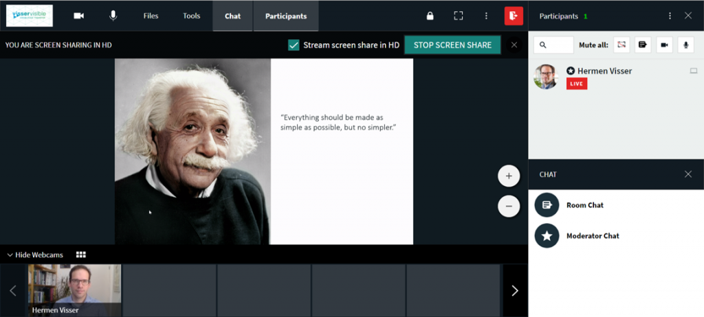
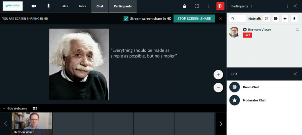
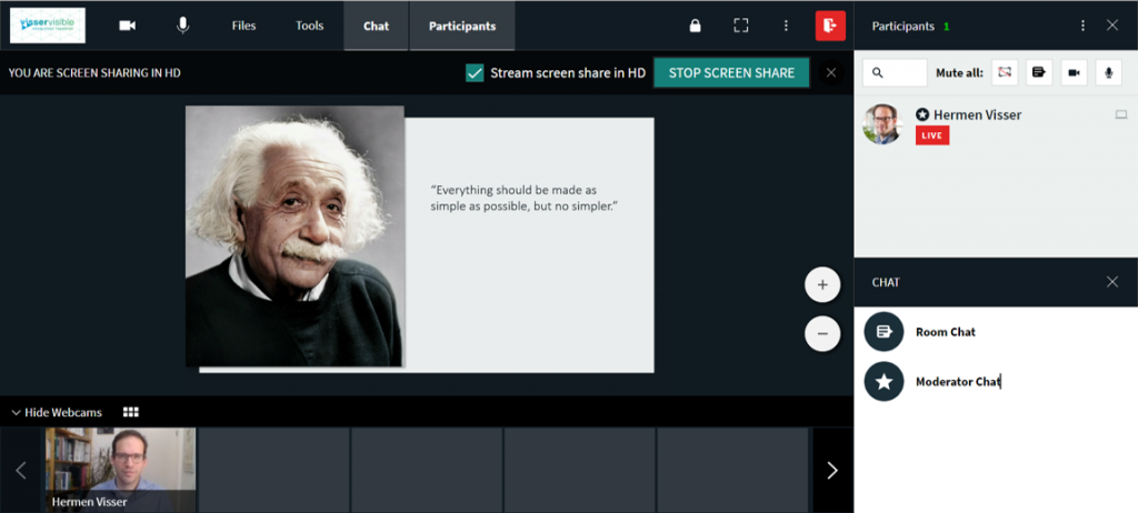
When I design the PowerPoint presentation of a client, I always want to know which platform the presentation will be given on. Thus far NWO uses Webex for Veni, Vidi, and Vidi interviews. I organize the training sessions with candidates for these research grants in Webex. It not only helps to design their slides, but also offers an opportunity to get used to the platform. For my own group training sessions I use Kaltura. Both platforms have their own colour palette. This is the basis for my slide design.
In the respective online environment (Kaltura, Zoom, Webex) I create a screenshot of the full screen presentation (Alt + Prt Sc). I paste this in PowerPoint (Ctrl + V). With the eyedropper tool I compose a colour palette that matches the colours of e.g. buttons, backgrounds, and texts. These colours I use in the slide master. I apply the darker colours to the slide background and the lighter colours to the texts. Middle tones are suitable for boxes, reds for creating focus. (text continues below video)
The real magic happens when you match the background of your slides with the direct surroundings in the online platform. The edges of the slides dissolve, the slides become invisible. Elements on the slide blend in with the online environment. The consequences are fascinating. If you present on a platform on which your thumbnail face appears next to your slide, then it seems as if your head is one of the visual elements on the slide (see presentation below). You become part of your slide. Another trick: use a fake slide. First create an invisible slide. Then insert a rectangle with the usual dimension of 16:9 or 4:3 (you could even create triangular or circular slides!). Now you can place elements (photos, text) in such a manner that they ‘escape the slide’. (text continues below video)

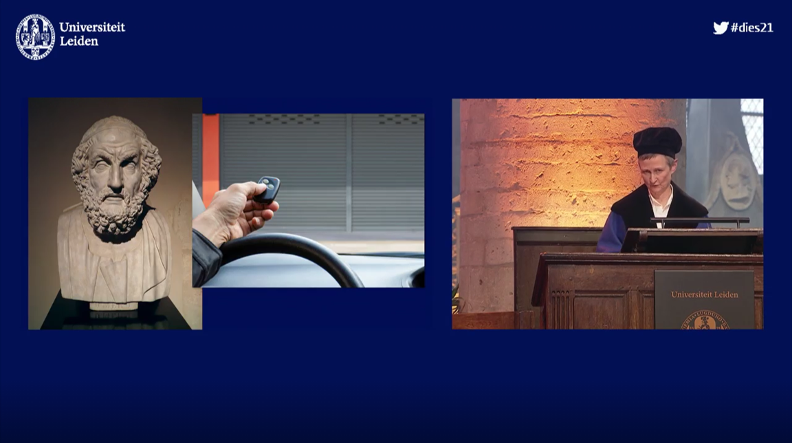
Homers automatic garage door in the online environment of the dies lecture of Leiden University. Because the slide is invisible, the elements appear within the same space as the live video of the orator.
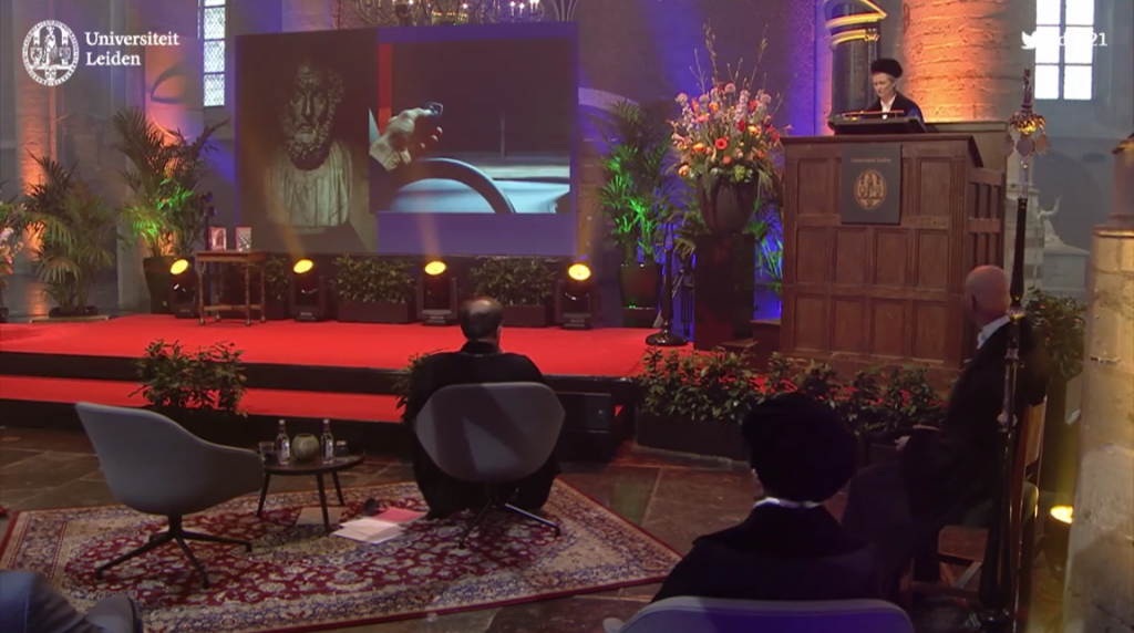
This is how it looked like in the offline ceromony in the Pieterskerk. It is a different experience: the edges of the screen expose my trick.
There is no arguing about taste. You might dislike my examples in this post. Aesthetic considerations aside, I am intrigued by this new game with invisible and fake slides. In physical spaces you always have the framework of your monitor or screen that encloses the visual elements on the slide (even when they have a black background). This links to a greater lesson: if you no longer try to do online what you always did offline, it opens new possibilities and leads to new discoveries. Thesis-antithesis-synthesis…